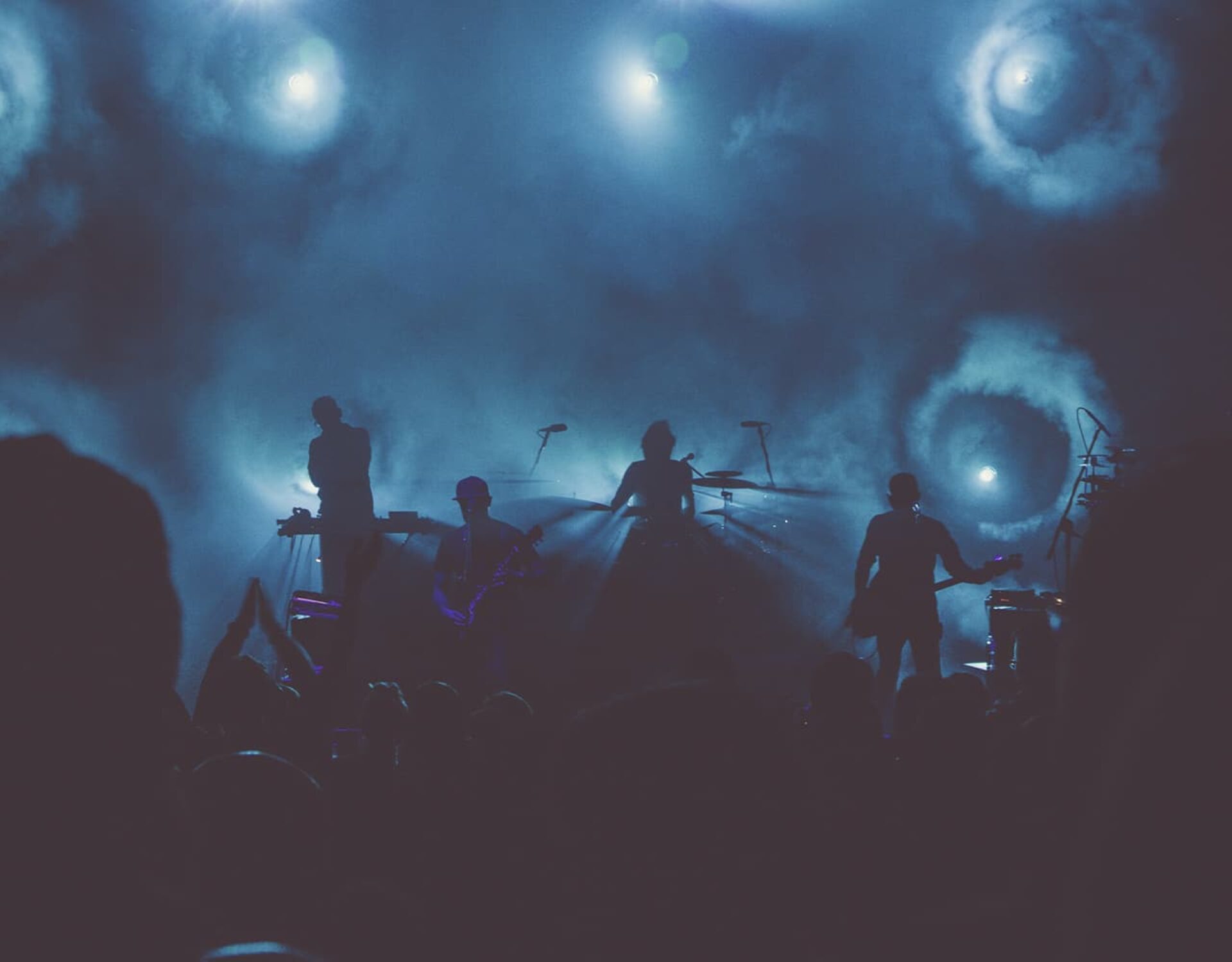

Greetings to everyone on the blog about making music and art! How do I come up with music/songs?How to record


Blog
Maximizing Space with Minimal Noise: The Advantages of Sliding Glass Doors for Your Music Haven
Have you ever dreamt of having a dedicated music space at home but worried your apartment or house just wouldn’t
What is an interlude in music?
Music is an ocean, vast and unending, a universe unto itself, filled with countless stories. Some are loud, resounding through
What Does a Music Note Tattoo Mean? An Insightful Look From a Muso’s Perspective
Greetings! I’m your friendly neighborhood musician, here to take you on a musical journey where ink meets melody. The question
Continue readingWhat Does a Music Note Tattoo Mean? An Insightful Look From a Muso’s Perspective
How To Choose An Outstanding Brand Name For Barber Salon
Are you looking to establish a new barber salon and need some help choosing an outstanding brand name? Finding the
Continue readingHow To Choose An Outstanding Brand Name For Barber Salon
A Comprehensive Guide to Writing Professional Music Reviews
Are you a passionate journalist intent on covering upcoming independent concerts? Or perhaps you are an influencer looking to spread
Continue readingA Comprehensive Guide to Writing Professional Music Reviews
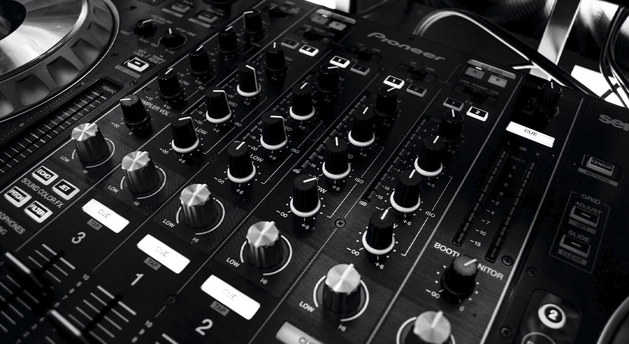
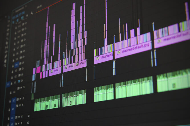
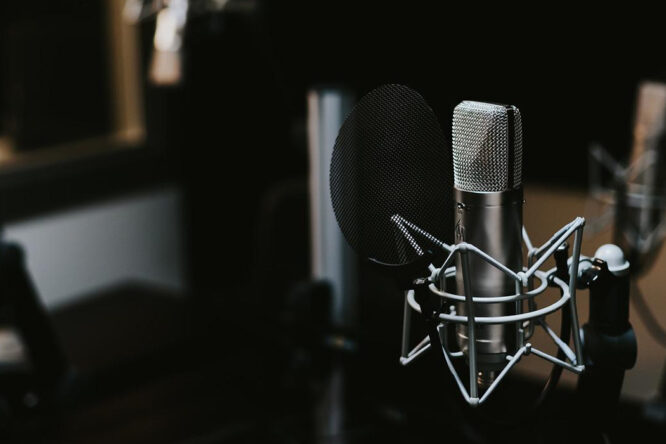
The Path to Becoming a Music Producer
If you’re passionate about producing music and creating beautiful soundscapes, then you’ll want to learn all the ins and outs
7 Tips to Choose Essay Topics About Music
If you are like most students, you are likely to feel that you don’t know enough to put your thoughts
How Art and Music Influence the Culture of World Society
Songs and artworks are quickly taking over society. Artists are working tirelessly to produce high-quality songs and arts to inspire
Continue readingHow Art and Music Influence the Culture of World Society
Game art: basic principles
Game art is a complex sphere, which, on the one hand, embodies creativity and creativity, and on the other hand, a set of functions. …
Purpose of the concept art
The history of the concept art that we now know from many digital portals, as usual, has its roots in the deep past. …